
CASE STUDY · GOOGLE MAPS ADD ON CONCEPT
Hiking Mode
A Google Maps add-on that makes the moment between driving and hiking feel confident, not confusing.
PROBLEM
Hikers juggle Maps to get there and AllTrails to hike it, and still arrive unsure of which entrance, which lot, which for.
SOLUTION
One add-on inside Google Maps: trailhead & parking guidance, on trail junction support, and a difficulty snapshot, surfaced before the hike starts.
IMPACT
Validated with 6 interviews + 5 usability tests
confirmed the concept and exposed exactly where to clarify it.
MY ROLE
Solo UX/UI — research → tested prototype · ~80 hrs
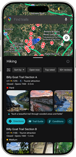
6
1:1 hiker interviews
3
core features shipped to hi-fi
5
moderated usability tests
~80
hrs
research through tested prototype
1
Discovery & Definition
DISCOVERY · EMPATHIZE · DEFINE
Google Maps gets you to the trail. It stops there.
Maps is already trusted for navigation — but the moment a destination becomes a trail instead of an address, it falls short. I chose to design inside Maps rather than build a new app, focused on the gap between driving and hiking.
→ Hikers juggle Maps + AllTrails for one trip
this part is kind of text heavy, add mobile screen small? or too repeatative?
→ The stressful part often happens before the trail starts
→ Opportunity: build confidence, not just add navigation
AllTrails
Mainstream trail discovery, strong community & conditions data.
Gaia GPS
Remote area GPS, offline first, built for experienced navigators.
Komoot
Turn by turn route planning & multiday trips.
onX Backcountry
Deep terrain tools for backcountry & technical routes.
Competitors
Six hikers, one shared moment of doubt.
"I parked half a mile away from the right trailhead — in Yosemite, of all places."
JOHN
"The trailhead pin was off the road, so I drove around looking for the entrance."
ANA
6 semi-structured interviews across experience levels · pattern: wayfinding from road to trail creates more stress than the hike itself.
The insight that shaped everything.
"
KEY INSIGHT
The hardest part isn't the trail, it's getting to it and knowing what to expect.
Trevor
PREPARED PERFORMANCE HIKER
Wants accurate route & condition data so he can plan efficiently and avoid avoidable mistakes.
May
CAUTIOUS BEGINNER HIKER
Needs simple, reassuring guidance, "if I know where to go, I can relax and enjoy the hike."
Megan
EVERYDAY SCENIC PLANNER
Wants hiking to feel calm, clear parking, entrances, and route expectations before she arrives.
2
Design
IDEATION · WIREFRAMES · PROTOTYPE
Three features, prioritized by real research-not feature creep.
P1
Trailhead & Parking Guidance
Wants accurate route & condition data so he can plan efficiently and avoid avoidable mistakes.
P1
On-Trail Route & Junction Guidance
Extra clarity at forks and connectors, where hikers second guess themselves most.
P1
Difficulty & Conditions
Snapshot
Surfaces difficulty, distance, elevation and conditions before commitment, not buried in a report.
The real challenge: separating "before" from "during."
Early drafts blurred pre-hike info with on-trail guidance, which made the feature feel cluttered. I had to be deliberate about labeling, grouping, and timing — when information should appear, not just what to include.
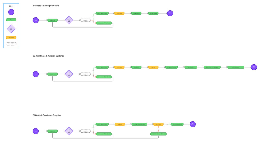
User flow (click to enlarge)
.jpg)
Low fidelity wireframes
should i label all of them?
Including the ones in pawport? since i want it to look clean?
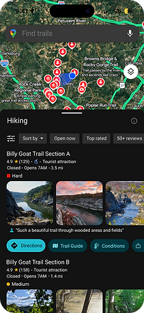
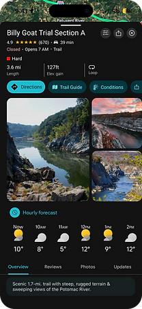
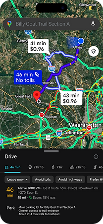.png)

High Fidelity simplified
check spacing for captions inconsistant
Designed for one-handed, fast scanning on the trail.
Search
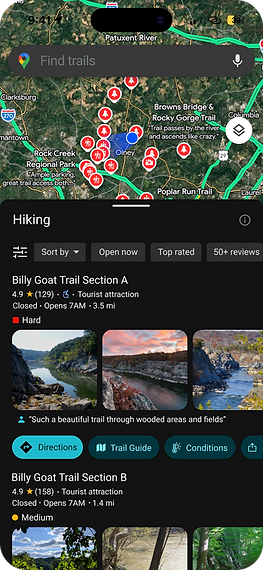
Difficulty surfaced early
Trailhead
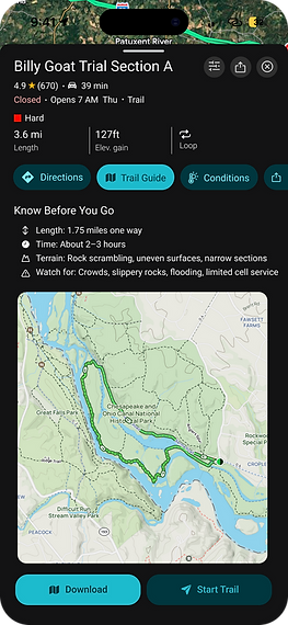
Trail guide and Overview
On-trail
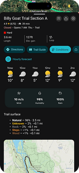
Conditions and surface type
3
Validation
TESTING · ITERATION · OUTCOME
The concept held. The structure needed sharpening.
5 moderated remote sessions across search, entering Hiking Mode, trail details, parking, and hike start. I measured completion, confusion/backtracking, and confidence, not just whether tasks were technically finished.
WHAT I TESTED
RESULT
Trail search & difficulty visibility
Clear, fast
Trailhead & parking guidance
Valued
Pre-hike vs. on-trail distinction
Needed separation
Method — 5 moderated remote usability tests on high-fidelity prototypes, modeled on the 6 research participants.
Small clarity fixes, big confidence gains.
1
Parking folded into directions
It didn't need to stand alone, integrating it felt more natural.
2
Sharper pre-hike / on-trail split
Clarified labels and structure so the two moments stopped overlapping.
3
Bigger touch targets, earlier difficulty
Larger buttons, refined spacing, difficulty shown sooner in search results.
BEFORE
.png)
AFTER
.png)
Search results — before & after iteration - showing the scroll up - noticeable? important?
OUTCOME
Clarity isn't polish, it's the feature.
Users didn't need Hiking Mode to do everything. They needed it to remove uncertainty at the exact moments it showed up: at the trailhead, at a fork, before committing to a trail.
6
hikers interviewed
3
features validated
5/5
usability sessions run